
This project was created as part of my UX diploma at the UX design institute. The task was to conduct research into how users feel about the flight booking process and create a new airline booking app based on these insights.
RESEARCH
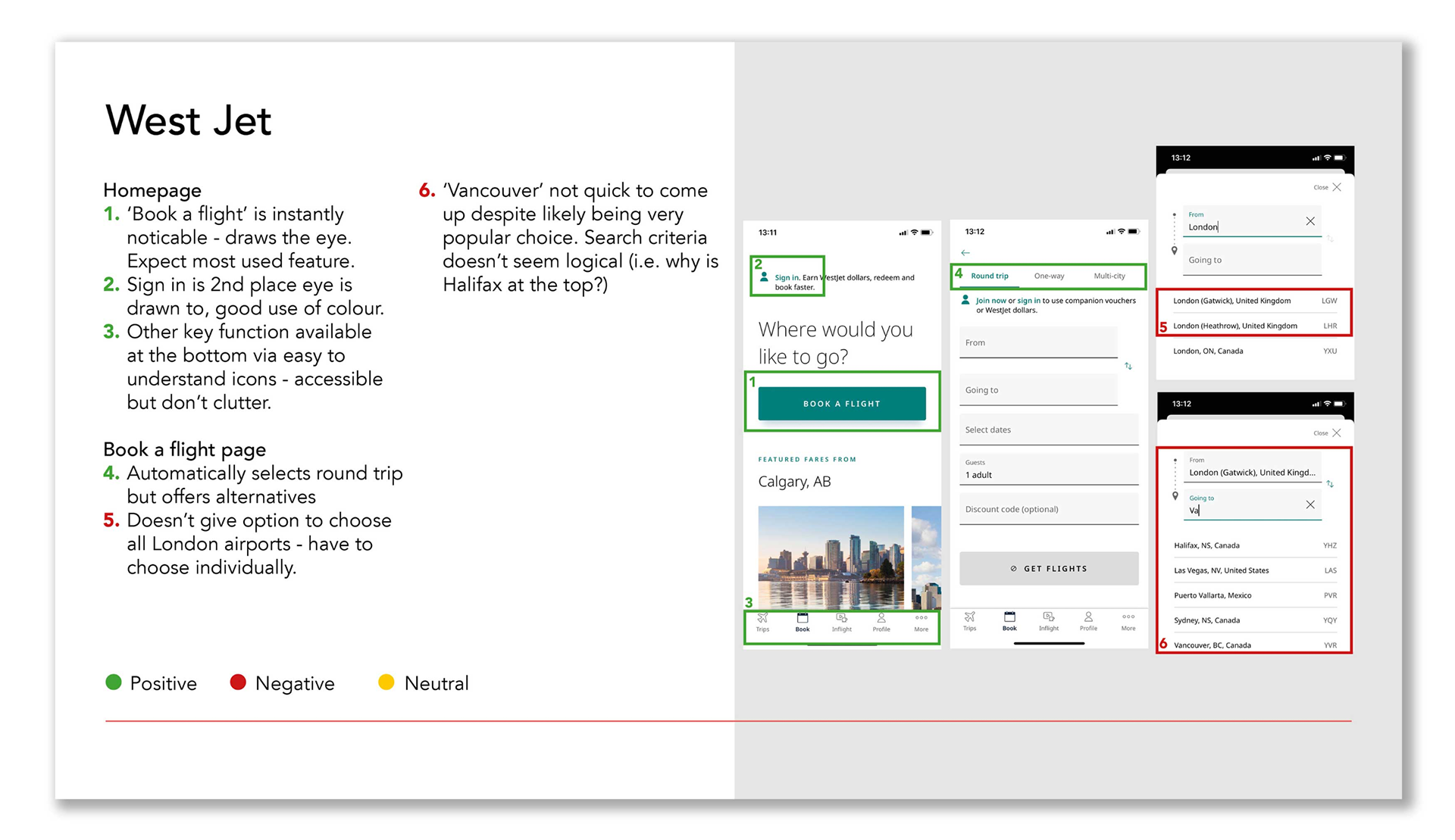
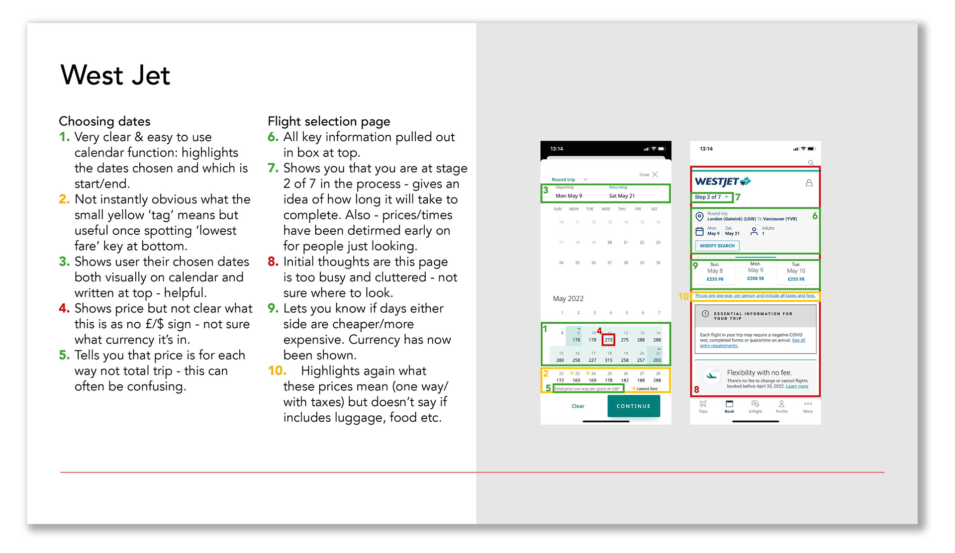
The project began at the research stage. I conducted competitor benchmarking for 3 popular apps: British Airways, West Jet and SkyScanner. I chose a mix of budget, premium and aggregator sites. I looked at the conventions used and best practise to follow, as well as identifying issues.
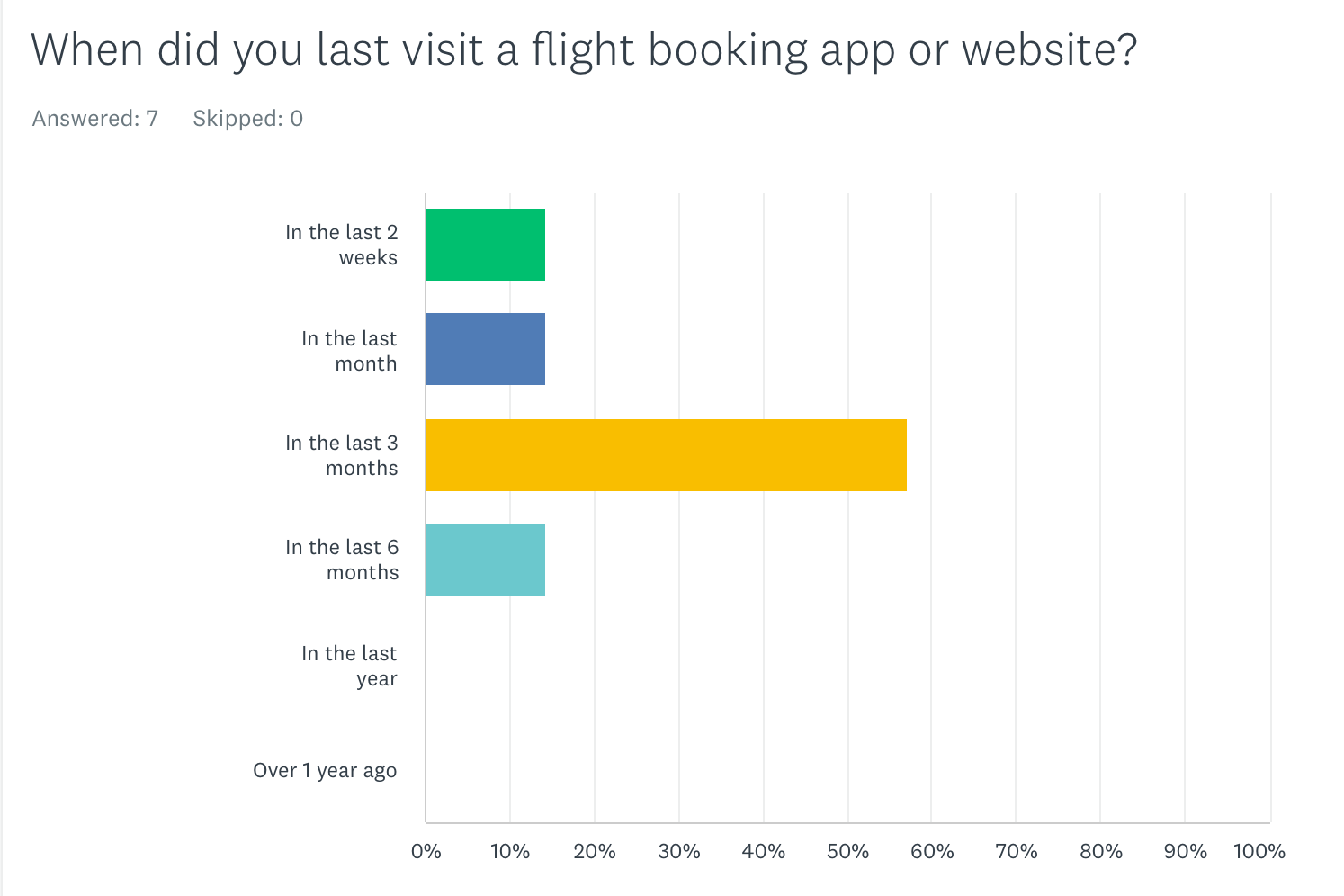
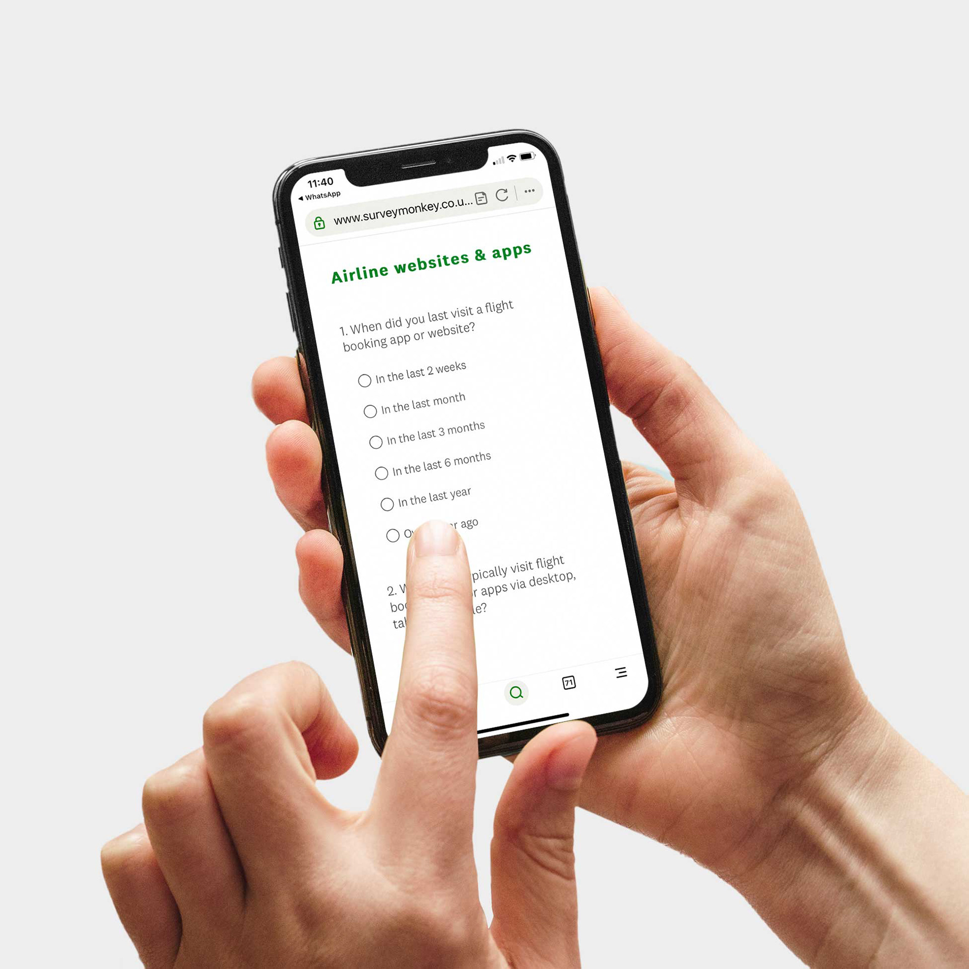
I also conducted an online survey, to get a high volume of data quickly.
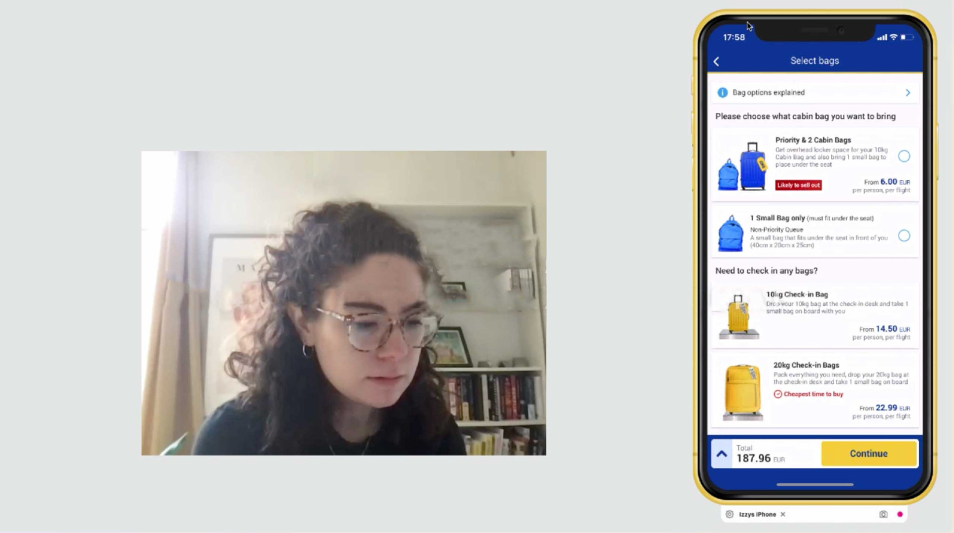
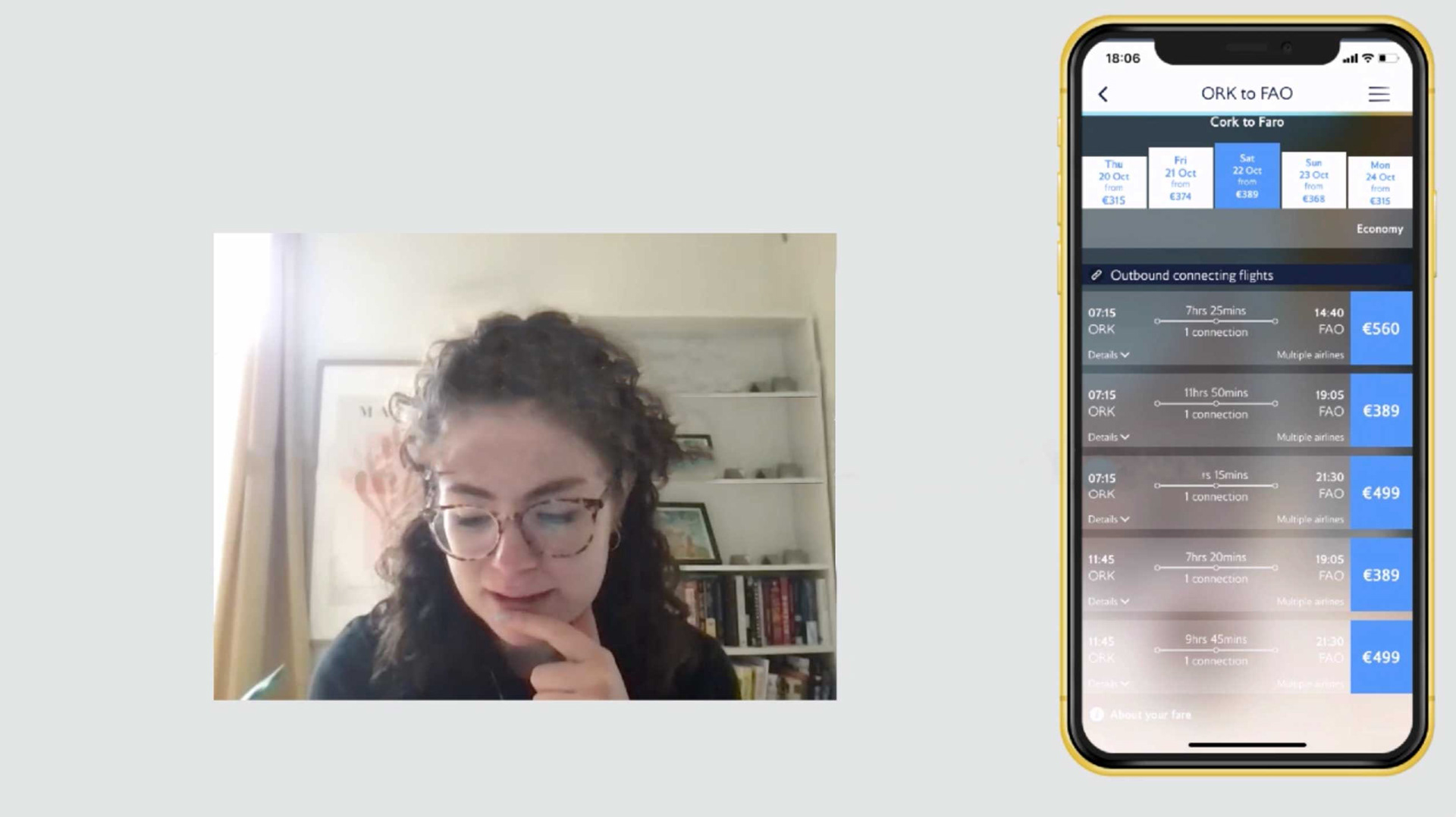
I then conducted usability tests on 2 websites - Ryanair and British Airways. This was to gain richer, deeper insights. These were carried out in person using Camtasia and Reflector.
ANALYSIS
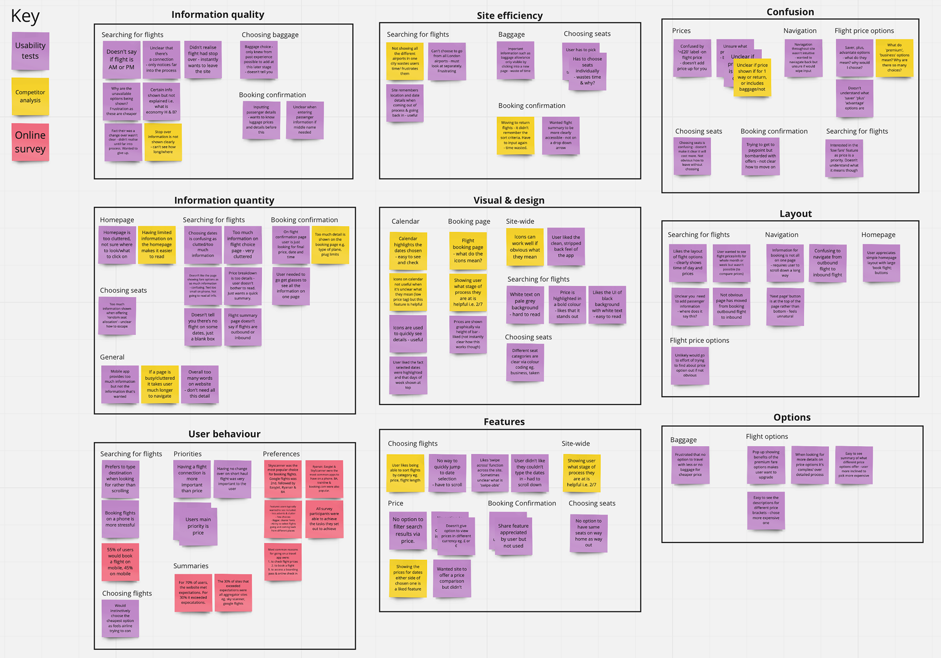
To analyse the data, I created an affinity diagram. Together with friends we noted all our research insights down on Miro post-its, before discussing the key groups and sorting into categories.
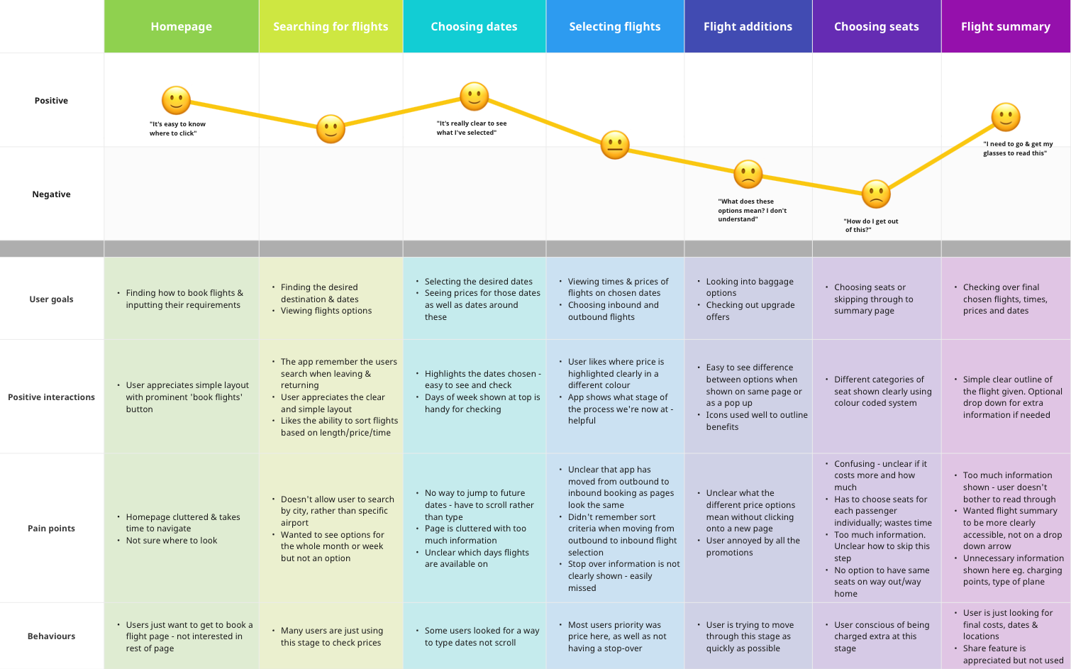
From this I then created a customer journey to help pick out which stages of the process needed work.
RESEARCH FINDINGS
From my analysis I started to see patterns emerge. These key areas for development were identified:
CLUTTERED PAGES: This was raised across all 3 phases of research. It was particularly an issue on the homepage, where users were confused where to click, as well as at the bag selection stage where promotions for extras often got in the way.
SLOW SEARCH FUNCTIONS: Users were frustrated by various search functions. When choosing airports, the local or most chosen didn't come up first or there was no option to search/quickly scroll, and when choosing dates.
FLIGHT PRICE OPTIONS: There was a lot of uncertainty on what different price brackets meant and what customers were getting for their money. Sometimes too little information was given, sometimes too much. This should be simplified.
PRICE SUMMARIES: There was confusion around if a price shown was for both people or one, if it included baggage or if it was one way or both. This could be rectified by clearer descriptions and better summary pages.
CLARITY ON STOPOVERS & FLIGHT DURATIONS: Users aired confusions about how long their flight was or if it had a stopover several times. This was often very small or not shown until the confirmation page.
CLEAR FLIGHT SUMMARY: Flight summary page was often not shown until after baggage and seat selection, which frustrated users if they then realised a mistake had been made and they needed to go back.
DESIGN
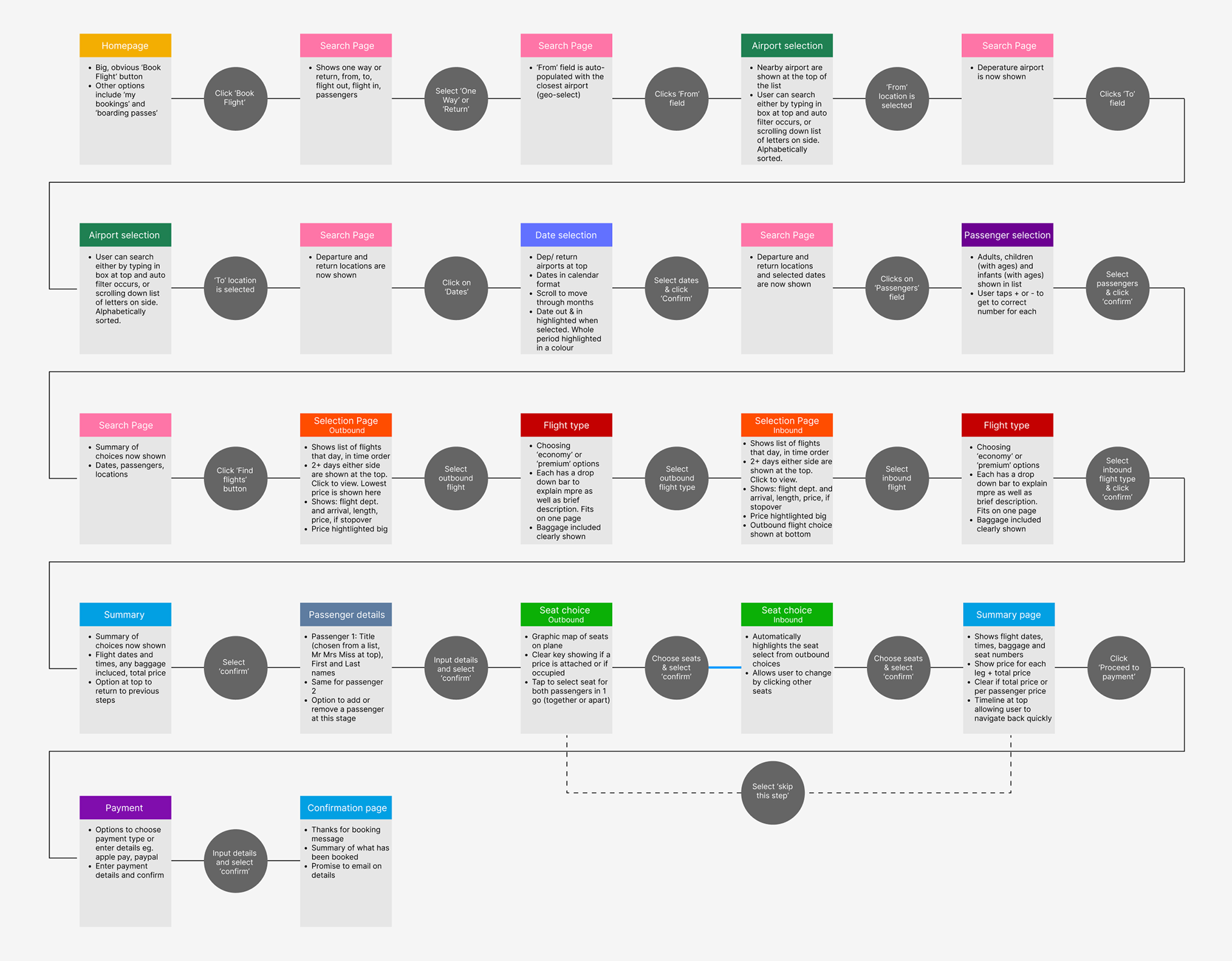
Using these research findings, I began the design phase by creating a flow diagram, outlining each screen state.
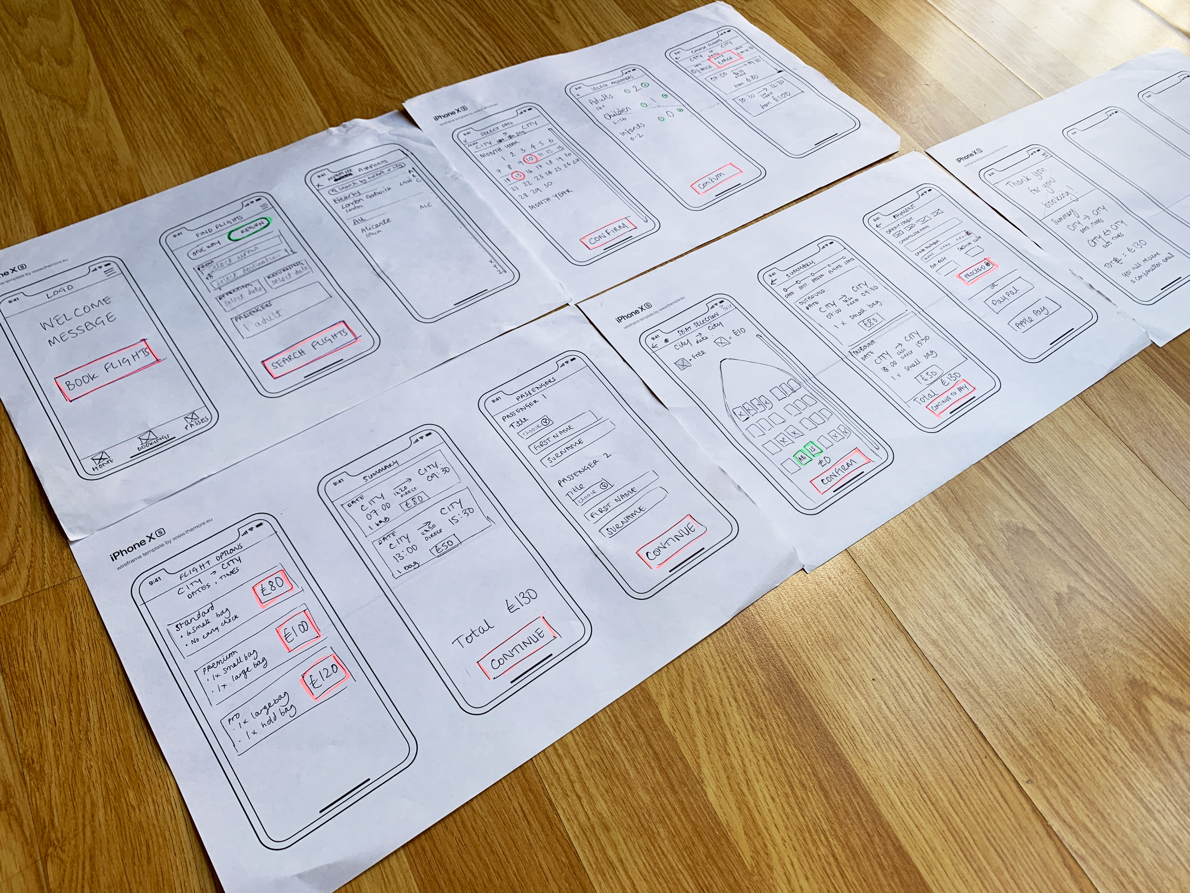
I then sketched out first stage wireframes and detailed the key interactions.
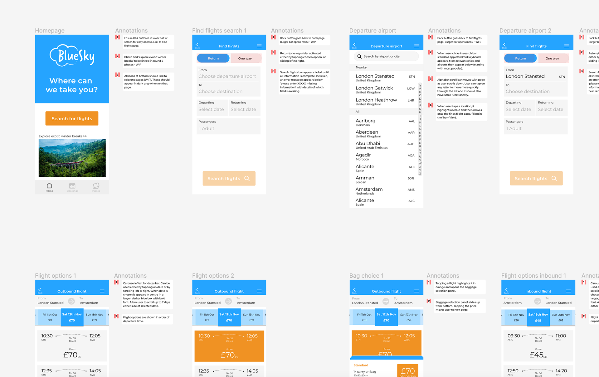
Moving on to prototyping, I set up a mid to high fidelity prototype in Figma. I added in basic level interactions so I could run a final round of user testing.
You can try it out below.
The final step was to annotate this prototype so it would be ready to pass on to the developers.
PROJECT LEARNINGS & NEXT STEPS
This project gave me a great overview of the whole UX process; from research and analysis through to design, prototyping, testing and iteration.
I learnt the value of in-depth and using varied research techniques and learnt how to apply knowledge from my Product Design degree to digital products.
I've learnt that the design process is never complete; we can always keep learning, iterating, testing and developing.
In a real-world case, I would develop this further. I would now start looking at other areas of the app; designing the menu bar and creating pages for managing tickets and existing bookings. This would be done in an agile workstream and I would start working closely with the developers.