
Role: UX design lead
Timeline: 5 months (8 weeks design & research, 12 week build)
Team: User researcher, Product manager, 2x front-end & 3x back-end developers
My input: Research, IA, UX/UI, prototyping, testing, accessibility

The Problem
Ratio.City's license purchasing process was creating friction for our customers and operational burden for our team. Customers had to contact our sale department for assistance, while the team had to manually handle invoice creation and license upgrades.
This caused:
• Long delays (up to 1 week)
• High drop-off at conversion (only ~4%)
• Frustrated users contacting support
• Frustrated users contacting support
Business Objectives
• Reduce time taken for user to buy licenses from days to minutes
• Increase conversion rates from free trial users to paid users from 4 to 10%
• Decrease operational overhead of customer facing team (from 30% of their time to 5%)
• Improve user autonomy in managing their own subscriptions
• Generate recurring revenue by simplifying upgrade paths
• Keep up with moving industry standards and set us apart from our key competitors

Research & discovery
Best practise research
Our research began by conducting competitor and best practise research. As in-app payments are common among SaaS products, we mainly looked at tools our customers would already be using (whether personal or professional) with high UX standards. This included Netflix, Spotify, Notion and Monday.
Personas
Our user researcher created personas for each of our key user types and drafted customer journey maps; this included municipal planners, private planners and developers, our internal commercial team, and members of the accounts teams from our user organisations. The accounts teams were a new persona for us that we hadn't tested with before so particular attention was paid to this group. We considered who would be making the payments, how they would be introduced to the platform and their familiarity with payment processes.
Design process
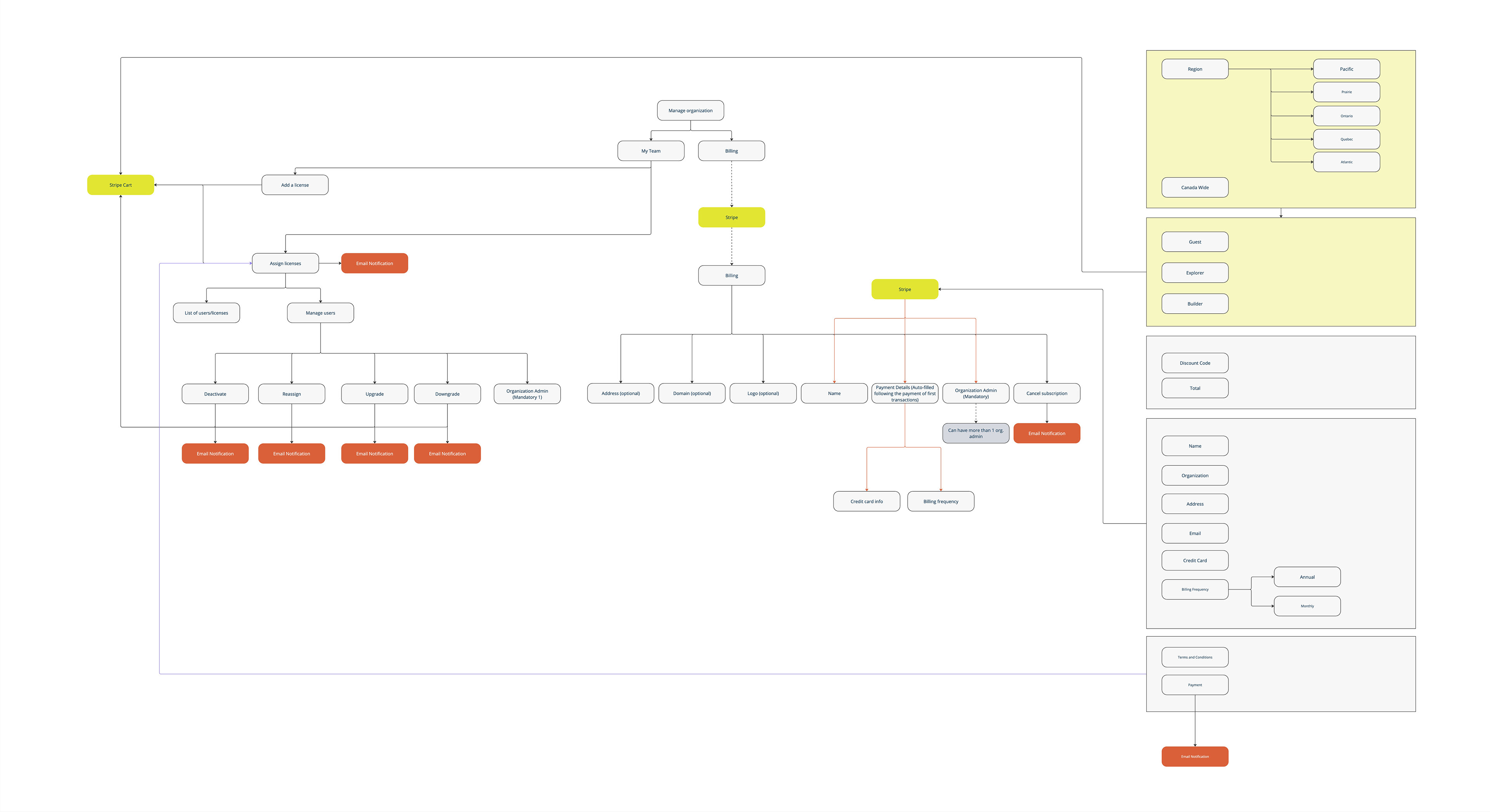
The first step was to set up the IA: this was a complex task that took time to figure out. I worked together with the industry and sales teams who held most knowledge on current processes.
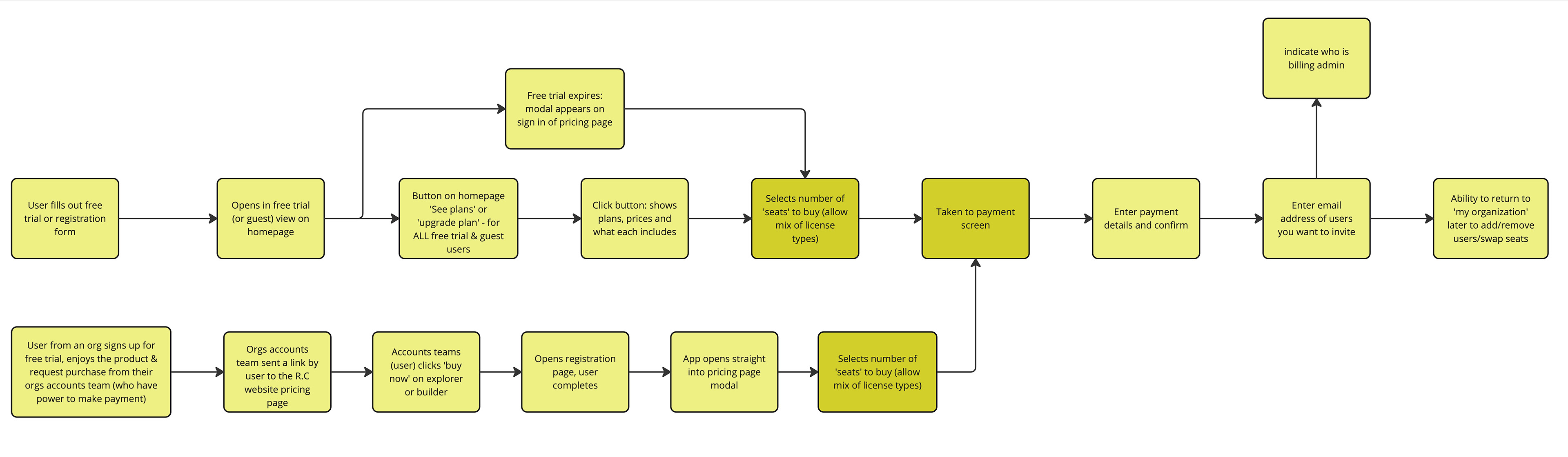
Next I created lo-fi prototypes for moderated user testing with our current customers. Feedback from user testing was positive, including:
‘It was clear and straightforward to do - very similar to other programmes I have used’
Dan (Developer)
However, there were some concerns with the new pricing structure & customisability of the packages. I recognised this could have significant impact on success if not fine tuned in the first release, so sessions were set up with the commercial teams to refine these, with additional rounds of user interviews.
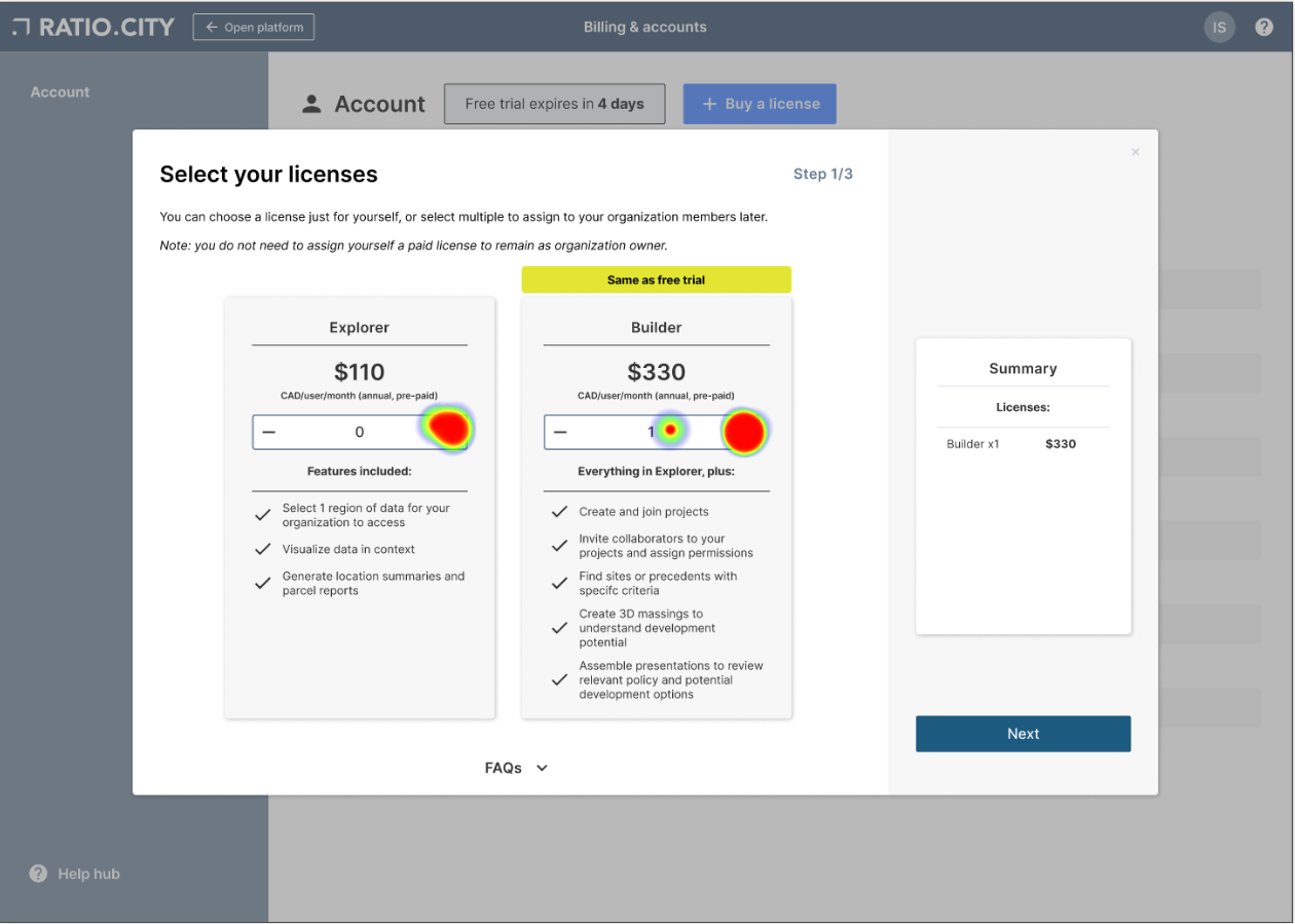
Hi-fi prototypes were developed and more testing was conducted via Useberry (unmoderated) with 25 industry professionals.
• 90% of users completed the flow
• Click rates which were generally accurate
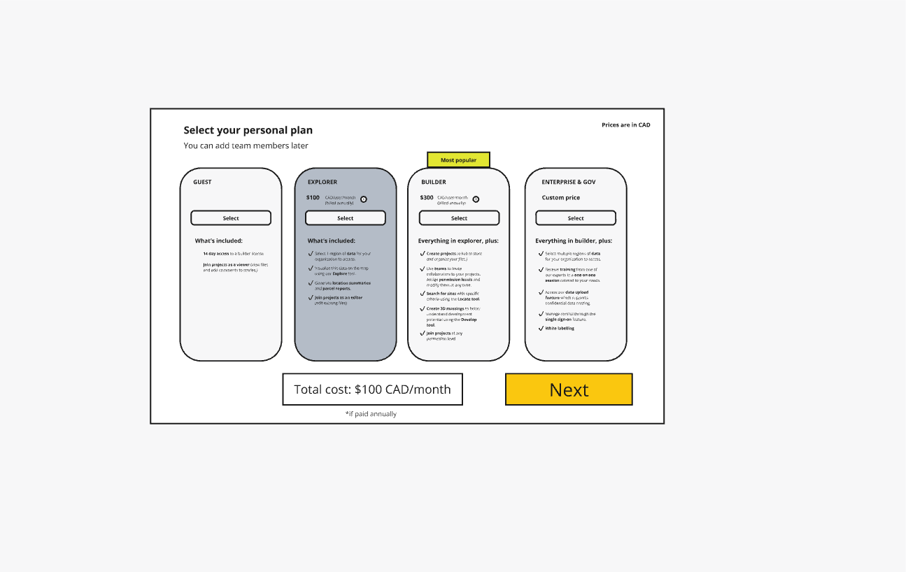
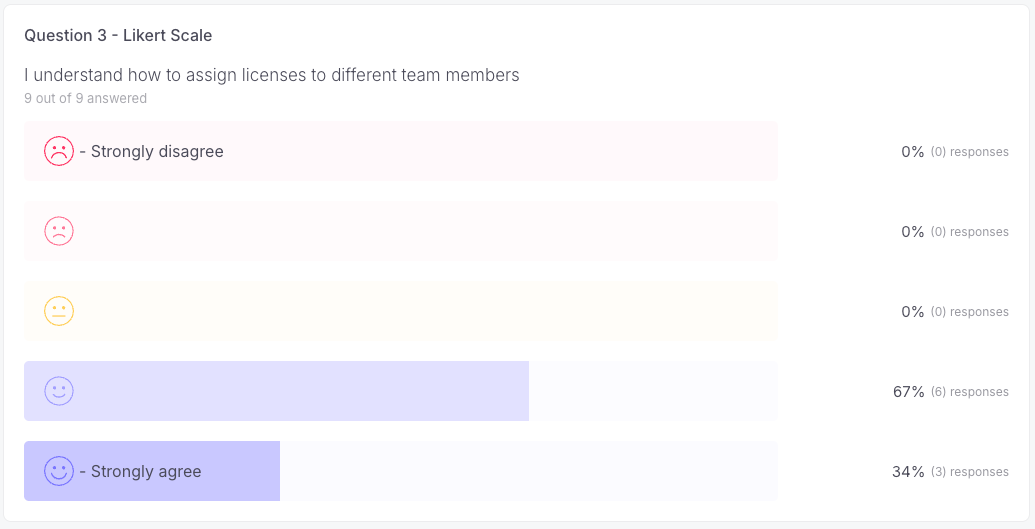
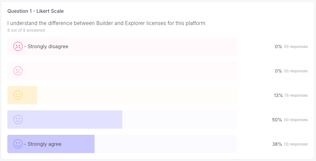
• Clarification needed on difference between 'Explorer' & 'Builder' licenses
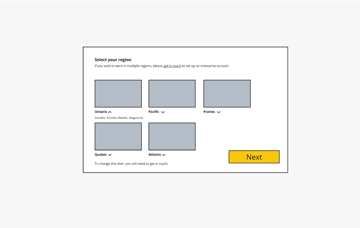
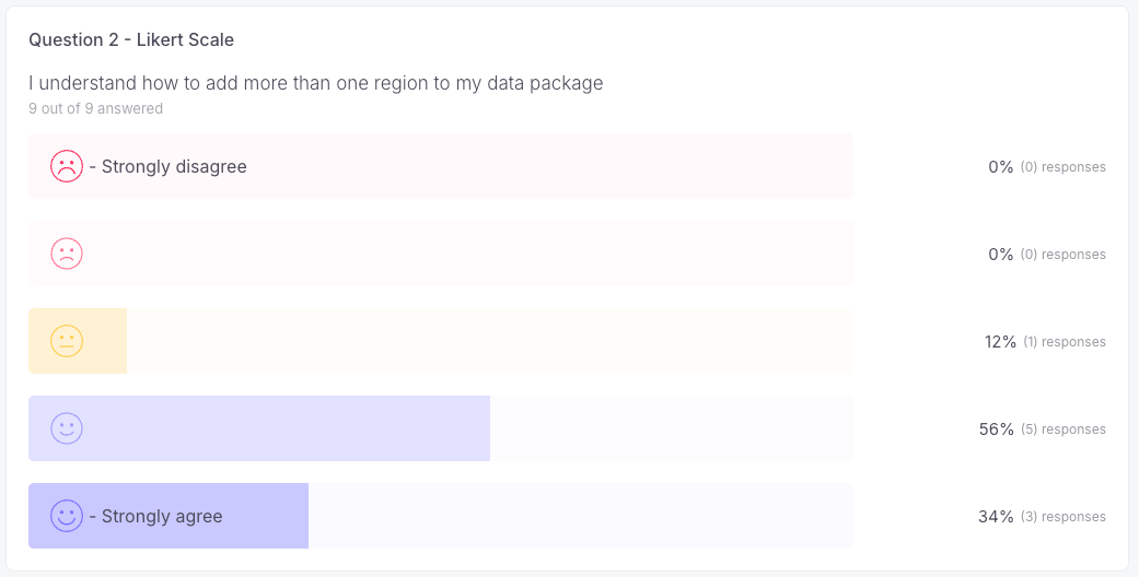
• Clarification needed on how to add more than 1 data region to the package
Comments included:
"Didn't realise that we have to press the ‘add more’ data button at the bottom of the modal to be able to select additional regions. Would be easier if I can just select additional regions directly?"
Unnamed tester, Architecture industry
You can see the heatmaps and survey results below.
Final design
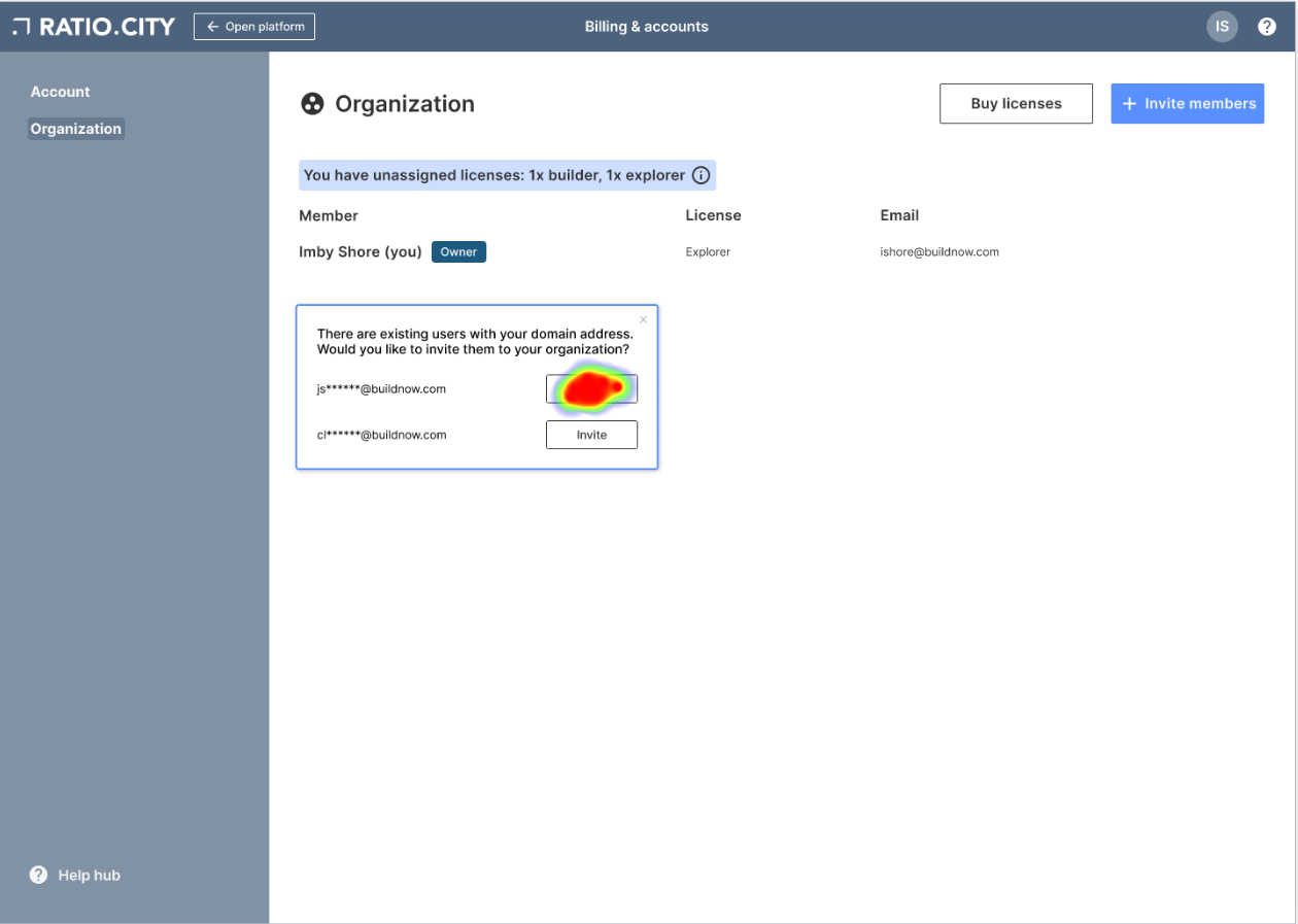
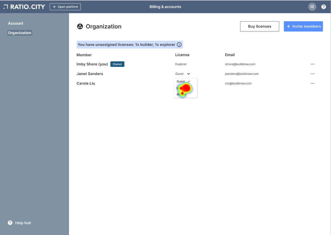
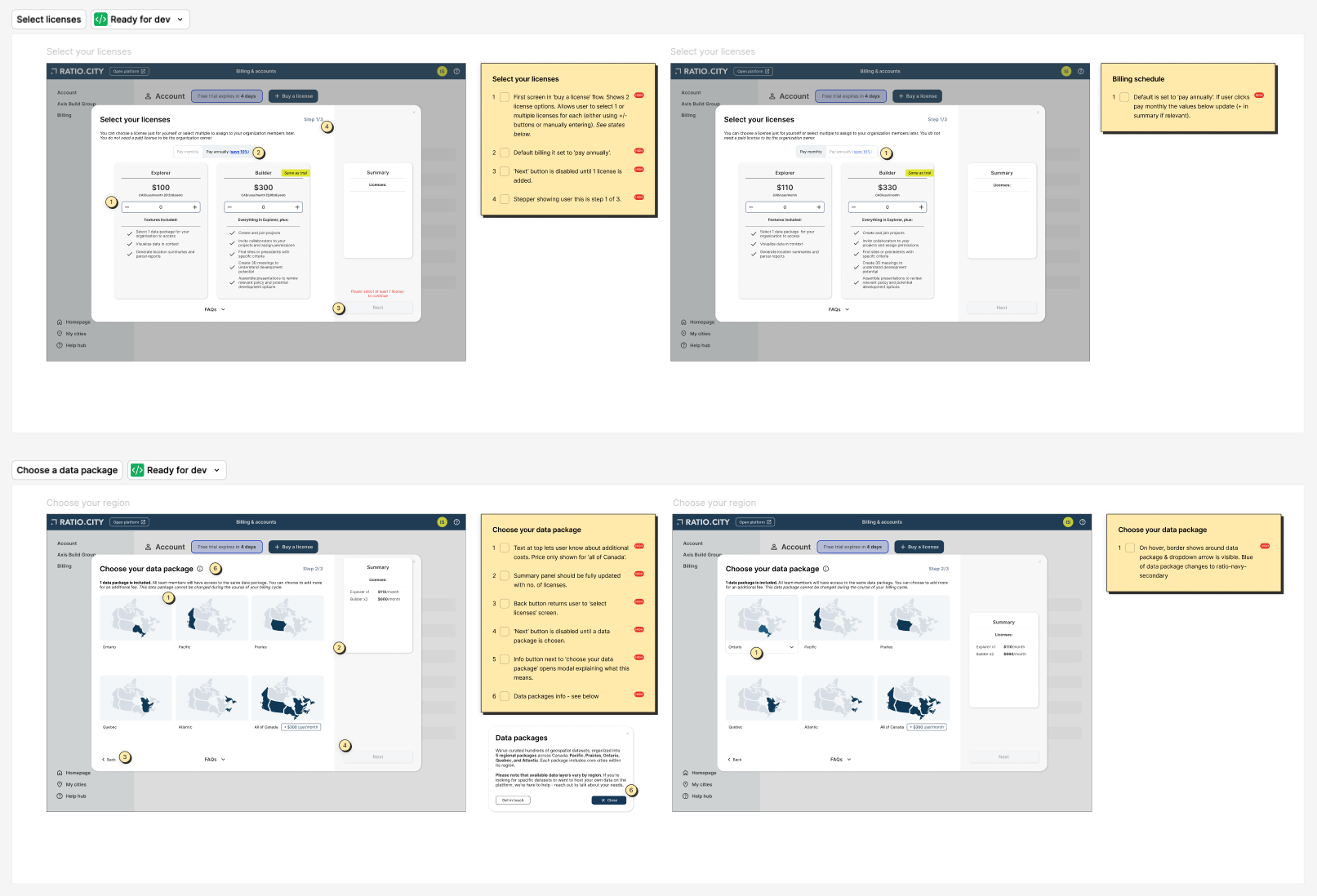
Using the research insights and user feedback, I created our final designs, addressing these concerns around data regions & license descriptions. Working closely with the back end team was essential to ensure the Stripe integration was seamless; I wanted the transition between our platform and the Stripe platform to be invisible.
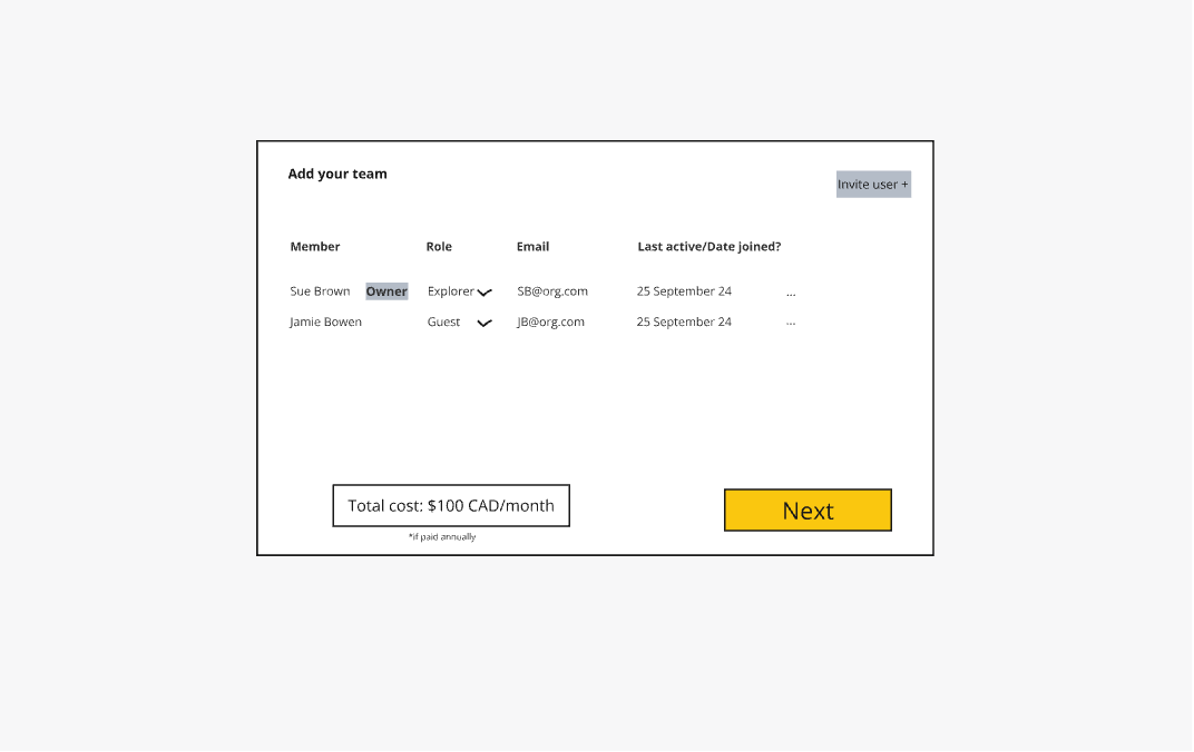
Below is a run through of the final design prototype I created in Figma.
A fully annotated file was handed over to the engineering team in phases. After build, a full accessibility audit was conducted, in combination with UAT.
Project results
In the first 3 months:
• Commercial team time spent on customer management reduced by 70%
• Conversion rates from free trial to paid users up from 4 to 11% (in combination with new Onboarding)
• 100% new user satisfaction
• Average of 10 mins to complete sign-up process (down from estimated 45 mins + long wait time)
• Increase in user satisfaction around pricing models. 50% of new users created one of the new ‘flexible’ packages. Ongoing tracking needed to see if discount options increase overall spend and reduce churn.
From a personal development perspective, this project taught me a great deal about product-led growth strategies, introduced me to Stripe methodologies and grew my knowledge of customer psychology when purchasing products. The competitor and best practise research section of the project was particularly useful here as so many standard UX flows have been established in this space.